
A Note From Charles –
I’ve known Kurt for the better part of a year now, and he’s been a major helping hand in increasing the profitability and value of several of my affiliate sites, as well as helped us increase the revenue from a client site we’d recently increased the organic traffic for by over 100% – Unfortunately though, even with the organic increases the revenue had only gone up by fairly small margin (in comparison to what traffic had grown by) due to the site itself having several reasons for customers not to buy. Kurt quickly came in, made a ton of recommendations which vastly improved conversion rate & revenue. I offered him to do a case study for it on my blog, and here we are.
So without any further ado, let’s make the most out of your current traffic!
Last month Charles approached me at CROguy to help him CRO one of his client’s websites.
The site was built on a custom content management system that had a bunch of non-standard website features that were holding back conversions.
Without any split testing, we identified a huge list of quick wins and website tweaks that allowed us to nearly double conversions within a few weeks.
“Quick wins” are areas in the conversion funnel that are holding back sales or conversions, making it hard for the user to buy, giving the user too many options, or are just plain confusing.
We will get into these a little later, but to make sure everyone is up to speed, let’s start at the beginning.
What is CRO?
CRO is conversion rate optimization.
The name alone is enough to scare some people off.
Let’s start by defining what a conversion is.
If you are reading this blog, you will most likely want to do one of the following:
- Convince a visitor on your website to click over to your affiliate offer or amazon and amazon listing with the hope that your review page has convinced them to buy.
- Convince a visitor on your website to click “add to cart” or ‘buy now’ on your eCommerce site.
- Convince a visitor on your website to opt-in to an email list so you can sell them stuff via email in the future.
Makes more sense.
So in other words,
What is the goal for the current page that the visitor is on?
Here is a quick pro tip. The less options you give your user, in most cases, the more the users will complete a specified goal.

How can CRO benefit your business.
I regularly see increases of 30-100% from very very simple conversion optimization.
SEO’s will spend $1000’s on PBNs to increase traffic by 30-100% but it doesn’t even occur to double down on the traffic they already have but optimizing their landing pages or sales funnels.
 For nearly all the affiliate SEO terms I search for, I can go to the top 10 listings and see straight away that 6-8 of these sites have just slapped a site together, started ranking it and haven’t even touched the look of the site again.
Look, I have been guilty of it too in the past.
That was until I started testing, and realised that most websites, whether an eCommerce or affiliate sites needed generally the same things to make the sites convert better.
Why do most people neglect CRO for their business?
With SEO there are hundreds of ways to get a website to rank.
Which ones do you choose? What is the 80/20?
What is the “80/20 principle?” Take a read here
Strong on-page and strong inbound links are the 80/20.
Easier said than done, you need a strong process and a step by step process to begin with before you start tweaking and adding in other variables.
That’s what we need for CRO.
A strong step by step process, or checklist, and then we can start playing around with the advanced strategies.
Re-adjusting your Psychological point of view.
My philosophy is simple when it comes to conversion optimization.
Simplify.
We want to give the user less distraction, less decisions and less time that they have to think.
We want to give them a clear path to our conversion.
For instance.
Most eCommerce websites have a huge amount of steps from when the click “add to cart” to when they click actually process someone’s credit card.
Why?
Most of the websites frameworks like wordpress are made by website developers. Not conversion rate optimization experts, not SEOs, not salesmen.
They are also made to suit everyone, and are super easy to customise.
The thing is, most don’t customise, they just assume that if a website is made the way it is, it is good for conversions.
It couldn’t be further from the truth.
Think about this, how many times have you;
 Gone to a website to buy something.
- Added it to the cart. Clicked next.
- Then asked to fill out a registration.
- Then signed up but haven’t entered a strong enough password
- Filled out a stronger password, but you forgot to add a capital letter.
- Denied again, 1 minute has passed.
- Said “F!#@ This!
- Gone somewhere else and bounced.
Alternatively:
Why not, instead, make it as easy as possible for the user to buy your shit.
- The user clicks add to cart
- Goes to single page checkout page with all delivery information and credit card information taken on a simple simple form and a “pay now” button, all on one page.
Again, simplify, test, and simplify again.
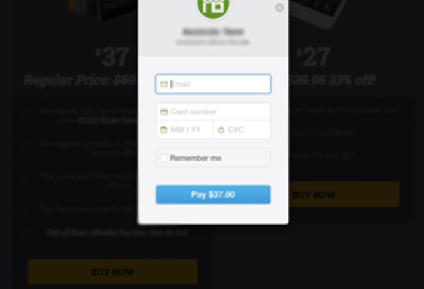
Or how about when a user clicks buy now, and the pop up credit card payment form comes straight up with a field for your email (for the eBook to be delivered) and it’s all done right there on the spot, right when the user is feeling the impulse to buy?
Think this increases conversions? Absolutely.
I always think about it like this;
What is the LEAST amount of info I need to get from the user to complete the conversion.
The absolute minimum I can get, so the user has to spent the least amount of time trying to buy my shit.
4 Client Takeaways for 2017
Now let’s get to the juicy bits.. Some real examples of increasing revenue.
1. Make the buying or conversion options as easy as possible.
We moved a client over from an old eJunkie interface where it took 4 steps for the client to pay, and they needed to pay via paypal and entered a shit load of info including address etc when it wasn’t needed.
We installed stripe and made it pop up in a modal window right there and then, where all they needed to enter was CC info and email and the eBook would be delivered straight to their inbox.
The sales process went from 3 – 5mins to under 20 seconds.
Making the buying process as simple has possible has resulted in some great increases in conversions and revenue.
Client 1 – Ecommerce site:
Removed unnecessary steps in the buying process.
- Removed registration signup
- Had a very confusing checkout page with 2 columns and huge bounce rate.
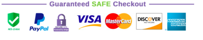
- Added credibility indicators all through the sales process to keep customers trust and prevent them from dropping off. Credibility indicators included: Adding lock badge below add to cart saying “safe and secure checkout”, returns policy badge and “Express Shipping Badge”
- Made the checkout button and pay now button a different color so it stuck out and caught the eye.
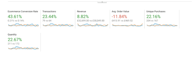
Conversion Increase: +43.71%
Transaction Increase: +23.44%
Revenue Increase: $30,049 to $32,699, +8.82% Increase on previous month for the same time frame.
Client 2; Ecommerce site.
- Improved site aesthetics.
- Removed a lot of white space
- Made it look better on mobile. Made call to actions a lot larger on mobile (50+% of traffic).
- Changed Add to Cart to “Buy Now” as most visitors only buy one thing off the site.
- Added credibility indicators to checkout process. Returns policy, Safe and Secure checkout etc.
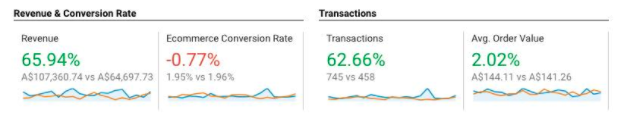
Conversion Increase: -0.77%
Transaction Increase: +62.66%
Revenue Increase: $64,697.73 to $107,360.74, +65.94% Increase on previous month for the same time frame.
2. Site speed and load times

Fractions of a second load times make a big difference.
Pay a developer that specialises in page load speed time optimization.
It’ll be worth your investment many times over.
Load your site into: https://gtmetrix.com and see how it rates.
Here is one site we made a few small tweaks to and more than halved load time;
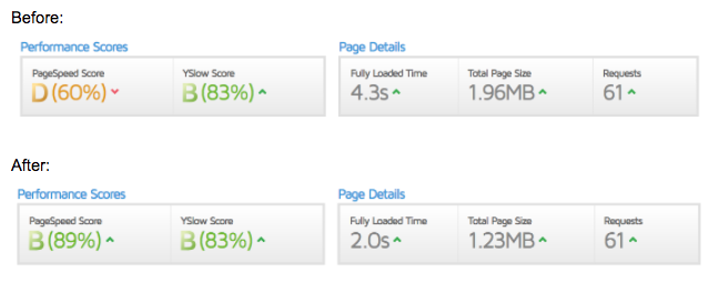
Still not an A grade (still ongoing) but will greatly improve conversions, instead of the user waiting around twiddling their thumbs.
3. Adding more call to actions down the page.
For one of our Pay Per Lead Clients he was getting 58 leads per month when we started optimizing his site for conversions.
The proposition is attractive, we get paid between $30 and $50 per lead coming through on the site. We set a goal to take leads from 58 to 200 in 3 months.
This would take our commissions from leads sent from $1,882.00 for May to $5,460.00 in August. A nice jump.
How were we going to go about it?
In one month we were able to just shy of 100. Still some way to go, but a lead increase of +42% in under 30 days is pretty impressive.
We have worked on 100’s of SEO affiliate sites in the last few years and the one thing that we ALWAYS do we completing a baseline CRO package is add more call to actions.
With our client his sites has the standard sidebar “Enter your info for Enquiry form” in the sidebar, and then the “contact us” page.
Why do we tend to make it so hard to allow the client to contact us?
Again, I always like to simplify everything.
Whether you have an affiliate site, eCommerce site or Pay Per Lead site make it super simple for the visitor to complete a conversion or goal.
All we did was add 4 call to actions spaced down the page of 1500 words saying;

When the button is clicked, a modal window pops up where we ask them the minimum amount of information: name, email, phone and then a send button.
Because we are getting paid per lead, every lead counts.
We don’t want to make it hard for the user to send a lead, so even if they are at the bottom of the page, we want a button right there in case they are convinced that the site they are on (your clients) is the best solution for their problem.
This also works for affiliate sites. Depending on what page they are on, I like to place 3 or 4 call to actions down the page to the affiliate offer, so that when they are ready to buy, they have a button ready to click;

You would have something like the above call to action on a product review page.
Important: There is a fine line between this working in your favor and working against you. You don’t want to add too many call to actions down the page as it just looks damn right spammy and can also work negatively against you for SEO.
My general rule of thumb is no more that one call to action in view at any one time on the page. Generally this means 2 – 3 call to actions per 1000 words. It is worth split testing to find the optimal amount. I have found 20-30% increases in conversions by taking away or adding in one more.
Also, split test plain text call to actions as well as buttons.
Generally buttons work better on sites that have mostly mobile traffic as it is easier to click, but this isn’t always the case and I have been surprised many times.
Thing to test: With popup maker, we also made it trigger when the user goes to leave the site, also known as an exit pop, showing the simple form which only takes a second to fill out. This also increased conversions for one of our PPL sites and is worth testing, especially if you have a large traffic website.
4. Add credibility indicators to your sites to re-assure consumer confidence and built trust.

In order for your visitors to fully trust you in a few minutes from when they first visit your website, to them entering their credit card (whether on an eCommerce site or Affiliate site) you have to re-assure them throughout the whole process.
At any point they feel like you won’t deliver what you say you will or the product won’t turn up quick enough, they will bounce.
Your copy, images and legitimacy of your site has been convincing enough for them to click “add to cart” or “click here for best price” button.
It doesn’t stop here.
Now this is a little hard with affiliate sites (unless you work closely with your affiliate product site owners) but this is a must for Ecommerce sites.
Most sites I see, especially when designed on WooCommerce or Shopify neglect this area.
Smother your Cart and Checkout page with credibility indicators.
What are Credibility Indicators?
When a user is filling out the checkout page what are they thinking?
- What if I don’t like my product?

- I need this problem solved yesterday, when will it arrive?

- Is my credit card safe?
The thing is, most of these questions are being made in the subconscious, hence why we need to address them before the visitor even realises it.
The decision to bounce from your site will be made before they even realise why.
Having credibility indicators like I have shown above, minimises the chance of the user feeling doubtful about making a purchase or buying the affiliate product you reviewed.
For affiliates: For sites with private offers (not amazon affiliates), contact your affiliate rep directly and discuss these options with them if they don’t have them.
You need to optimize the whole funnel from start to finish.
Not only will it help your affiliate payout go up, but it will also increase their bottom line. If they aren’t willing to work with you, maybe it’s time to find a new partner, or create your own version of the product for much better margins, you already know the product sells and at what volume.
Resources mentioned in this post.
- Pop maker paired with Gravity Forms for wordpress. (the extra features in the premium versions are well worth the cost).
- Pingdom
- GTMetrix
There can be an infinite amount of things to test and trial when it comes to CRO. What I have outlined above were the most common things we saw very quick increases in conversions from.
Once you get started, you will appreciate the value of CRO and how much it will increase your profitability. It should be added to every SEO’s arsenal and used in combo with onpage and offpage SEO.